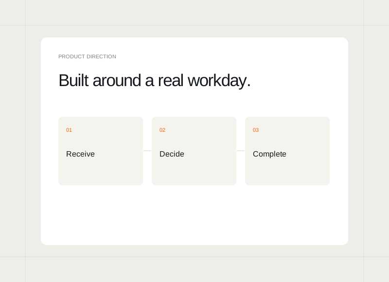
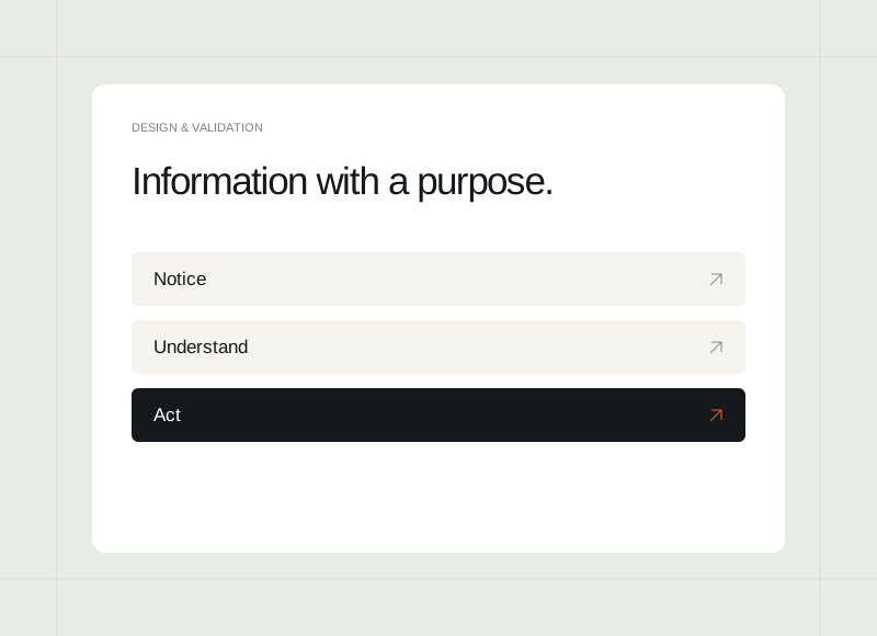
A dashboard can contain plenty of information and still leave someone unsure what to do. Start by identifying the people using it, the decisions they make, and the moment when those decisions happen. That context gives each panel a reason to exist.
Describe the next action
Ask what a person should be able to decide after reviewing the screen. They might need to assign a request, investigate a delay, or choose the next task. Those actions suggest a different hierarchy from a screen whose main purpose is a broad periodic overview.
Give information enough context
A status or total needs a clear meaning. Explain what it refers to and which period or view is currently selected. Avoid assuming that everyone shares the designer’s interpretation. A smaller amount of well-labelled information can be more useful than a dense set of unexplained numbers.
Separate overview from investigation
Let the first view help someone identify where attention is needed. Provide a clear route into the detail that explains a particular item. Trying to show every possible field in the overview can make both scanning and deeper work more difficult.
Review with an ordinary working example
Use a realistic situation to walk through the screen. Ask where the person would look first, what they believe the information means, and what they would do next. Use the gaps in that explanation to refine the dashboard before adding more panels.