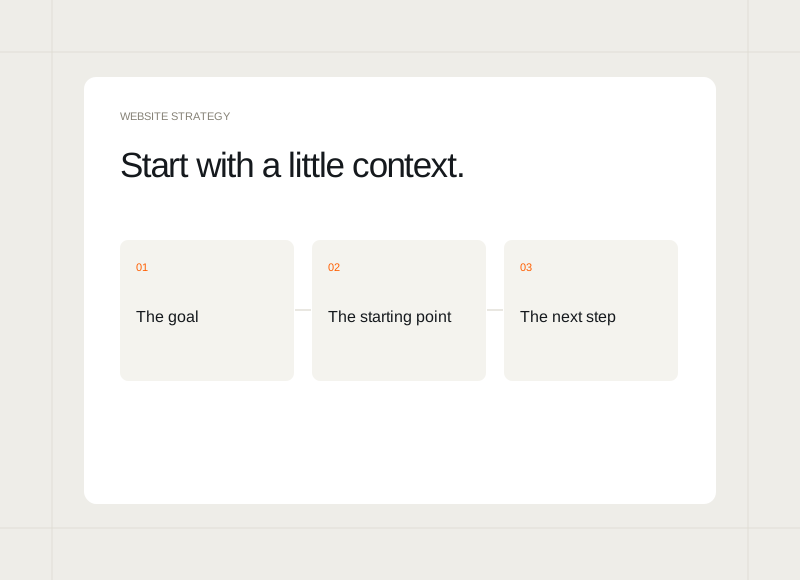
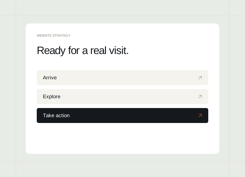
A website can look complete while an important journey still leads nowhere. Before launch, review the experience using the tasks a visitor is likely to bring. The goal is to notice gaps in meaning, navigation, and behaviour while there is still time to address them.
Start from the likely entry points
Visit the homepage and a few pages someone may reach directly. Check whether each explains its purpose and provides enough context to continue. A service page or article should remain understandable even when the reader has not seen the introduction on the homepage.
Follow each meaningful action
Try the main CTA, menu destinations, category filters, and any preview controls. Check the page or state that appears after the click. Confirm that labels describe the actual result and that the way back is clear. A visually correct button still needs to lead somewhere useful.
Use realistic content and different widths
Look at long headings, complete articles, and the actual images intended for publication. Review narrow and intermediate layouts as well as desktop. Notice whether important controls overlap, information becomes cramped, or a sticky element covers the content someone is trying to read.
Record the remaining limits
Keep a clear list of unresolved items and the people responsible for them. Distinguish a deliberate preview limitation from something that should work at launch. Review that list alongside the final site so the decision to publish is based on its actual state, rather than the appearance of a finished mockup.