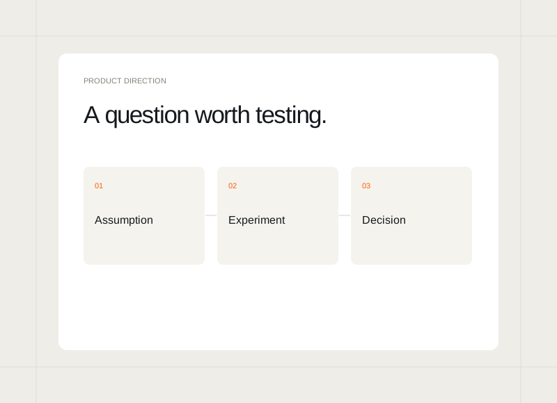
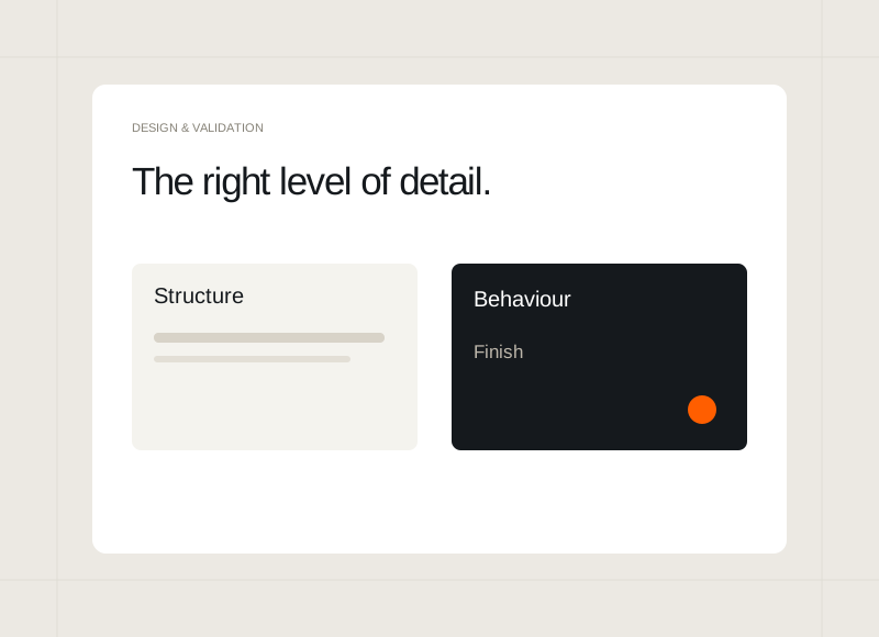
A prototype can be a rough sequence of boxes or a carefully styled interactive preview. Neither is automatically the right choice. The amount of detail should help people answer the question in front of them without creating unnecessary work or implying that unresolved decisions are already final.
Start with the review question
If the team is discussing the order of information, rough screens may be enough. If the question concerns how an interaction feels, the preview may need more realistic behaviour. State the purpose before choosing the level of finish so the work supports a decision.
Keep content realistic enough
Even a simple prototype benefits from plausible labels, page lengths, and examples. Placeholder text can hide structural problems. Use the kinds of information the actual product will contain, while clearly distinguishing sample data from any real customer or operational record.
Make the boundaries obvious
Tell reviewers which paths work and what the prototype is intended to demonstrate. A visually polished screen can create expectations of a complete system. Clear boundaries help people focus their feedback and prevent a missing interaction from being mistaken for a settled product decision.
Add detail where uncertainty remains
After each review, decide what needs greater clarity. Refine the relevant part instead of polishing every screen equally. The next prototype can become more detailed as decisions become firmer, keeping the effort connected to what the team still needs to understand.